How to use moving averages to find stocks that are trending higher

When it comes to different approaches to the stock market, fundamental analysis and technical analysis are often seen as two completely separate disciplines.
With fundamentals, the focus is on stock selection and using data to uncover a company’s strengths and weaknesses. From there you can take a view about valuation and make predictions about the future.
With technicals, the starting point is that the market has priced-in everything there is to know about a stock. From there, it’s all about using different techniques to predict where the share price will move next.
At first glance, it’s easy to see these two tribes as following very different paths. But the truth is that investors on both sides borrow ideas from each other.
Some technical traders, for instance, won’t open positions in stocks without strong growth trends that only show up in financial statements. Likewise, many stock-picking analysts wouldn’t dream of buying a share without seeing strong trend confirmation on a price chart.
One technical measure that comes closer than most to transcending these disciplines is the Moving Average.
On one hand, the MA is capable of being used in sophisticated technical strategies. But on the other - and this is important for regular investors - it can be put to work very easily to tell you a lot about sentiment and trends. These can be useful signals when it comes to timing trades and detecting when trends are changing.
In this article, we’re going to look at how you can do that (without even using a chart), and how to screen for stocks in bullish trends, including the all-important Golden Cross.
What are moving averages and how are they used?
Take a look at a stock chart over any timeframe and much of what you’ll see will be the noise and volatility that naturally push and pull on prices. What might not be so obvious is the underlying trend in the price. Is the stock on the up or is it falling out of favour?
Price trends over varying time frames are important to investors for different reasons. For some, trends can help determine areas of ‘support and ‘resistance’ in prices. But for others they can simply be an extra confirmatory signal about what the market really thinks about a share.
Moving averages reduce noise and let you see the trend. They work by plotting the average share price over a fixed timeframe. Those time frames typically range between 50 and 200 days, but are by no means fixed. Indeed, in trading they can be as short as a few days, hours or even minutes.
The MA that you’re most likely to come across is the Simple Moving Average, or SMA. In charting you may also see the EMA, or Exponential Moving Average. This works in a similar way but uses a calculation that puts more weighting on the most recent prices (chart packages will do that work for you).
To calculate a simple 200 day moving average, add together the close prices of a security over the past 200 days and then divide that by 200. The formula is then recalculated for each new day.
Doing this generates a trendline that overlays the price chart. The longer the MA period you use, the less sensitive the trendline will be to share price movements. Conversely, over shorter MA periods the trendline will move much more in step with the share price.
Here’s an example of how that works:
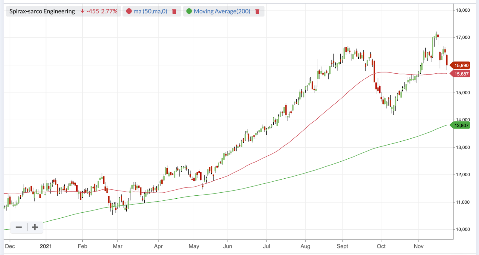
On this one-year price chart (above), the green 200 day MA line captures the general uptrend that’s visible in the share price. But the red 50 day MA line stays much closer to the price. It gets steeper as the price increases but then flattens as the price pulls back.
The next chart (below) is similar but you can see that a substantial fall (and subsequent rise) in the share price, causes the 50 day MA line to cross below (and then above) the 200 day MA. This is important because it’s these kinds of crosses in MAs that can signal a change in the trend.
Specifically, when the 50 day MA crosses above the 200 day MA, it’s known as a Golden Cross (the opposite is a Death Cross). Golden Crosses can signal near-term price acceleration - which is what you see in this chart. Some investors use the Golden Cross as a buy signal.
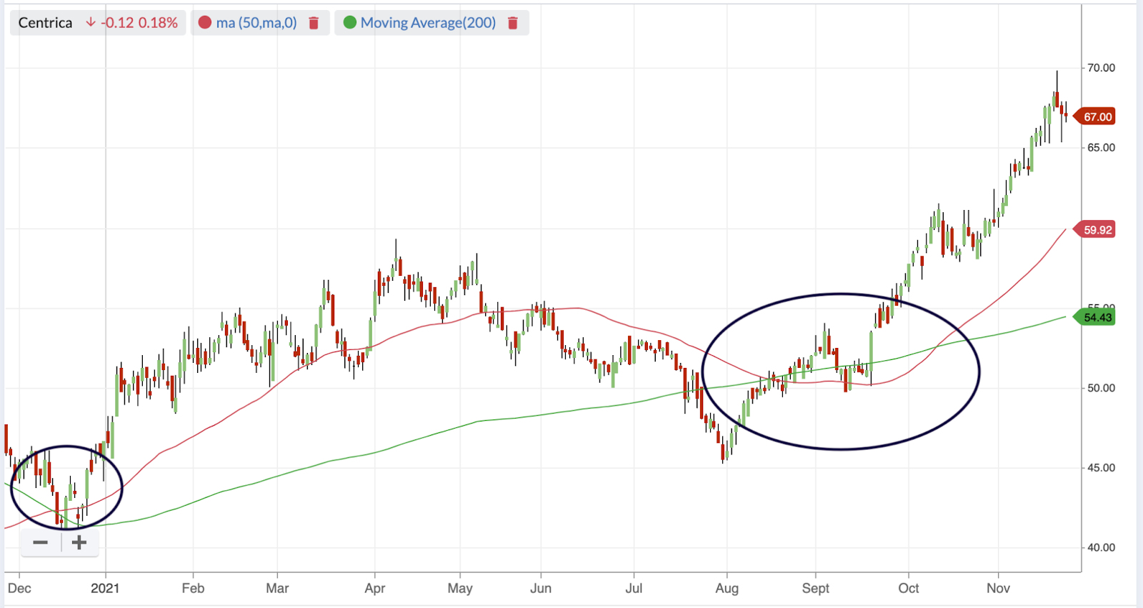
It’s fair to say that technical investors can go into much more detail with moving averages. But what this basic chart shows is that the golden crosses (circled) marked the start of upward and sustained changes in the price trend.
What’s also interesting in this chart is what happens when the price itself crosses below the 200 day MA (in July and August). The falling share price was steep enough to break below the longer-term 200 day trend, which was a negative move. But as the price recovered and broke above both the long and short term trends, things looked much more positive. Then there was a Golden Cross in October which marked the start of a breakout.
Using Moving Averages in your investing strategy
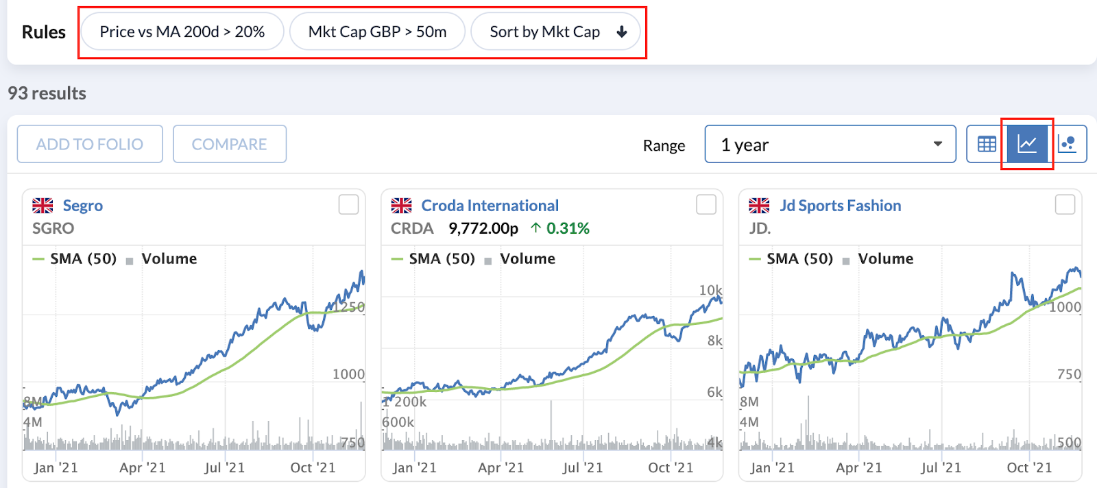
Moving averages are one of the main overlays that can be applied to any technical stock chart, which you can find on Stockopedia (like this one).
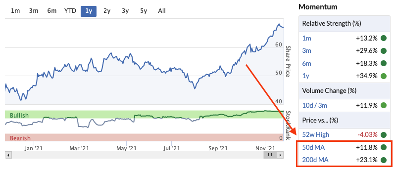
But even without a chart, the good news is that there is a useful technical “heads-up” on Stockopedia StockReports. The Momentum panel shows details of where the share price is trading versus both its 50 and 200 day moving averages.
In this case, the price is ahead of both trendlines, and the green Traffic Lights confirm that these scores are among the strongest across the market.
The security in the graphic below is the same as the one in the chart above.
This is useful for individual cases, but if you’re interested in finding stocks with similar charts, or you have a moving average set up in mind, there are options that can help in the Stockopedia Screener. Generally, the Screener doesn’t yet include charting or technical indicators, but there are some moving average rules that can help....
How to use Moving Averages to avoid stocks on poor trends
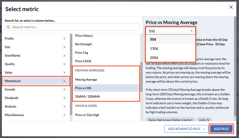
If you want an instant assessment of whether a stock is on an up or down trend, the Price versus MA (50d, 130d or 200d) can help. It’s not a particularly demanding rule but adding it to your screen will immediately filter out securities that are trading below these trends. So it can be used to help you avoid stocks with negative momentum.
You can find this rule by opening the Rule Picker (below, which launches when you click “Add Rule” in the Screener), and then selecting “Momentum” and then scrolling to the Moving Averages rules:
By looking for stocks with prices trading significantly higher than their long or short term moving averages, you can quickly create a screen of some of the strongest trending stocks in the market.
For some investors, this kind of rule can actually be a starting point rather than just a final check. You can find a screen with this rule here
How to find uptrends and Golden Crosses
Finding stocks with near-term accelerating price trends has obvious appeal. Classically, this tends to show up when the 50 day MA crosses above the 200 day MA - the all-important Golden Cross.
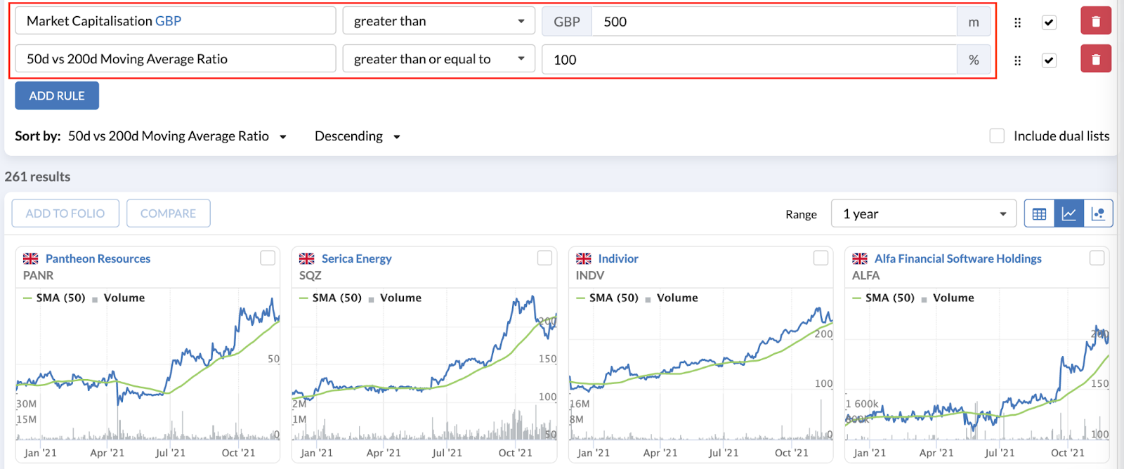
Stockopedia’s screener can help you to identify stocks that have passed the Golden Cross with the help of the 50d vs 200d Moving Average Ratio. With this you can:
- Screen for the Golden Cross
- The 50d vs 200d Moving Average Ratio should be equal to or greater than 100 (You can copy and save this screen)
- Screen for the Death cross
- The 50d vs 200d Moving Average Ratio should be lower than 100
Filtering for different price acceptance theories
While the 50d vs 200d Moving Average Ratio is the quickest way to screen for the Golden Cross, the two moving averages are also available to the screener to use independently against price.
With Golden Crosses, the 200 day MA always has a greater positive distance from the price compared to the 50 day MA. With this in mind, you can tailor the independent metrics to find different types of Golden Cross:
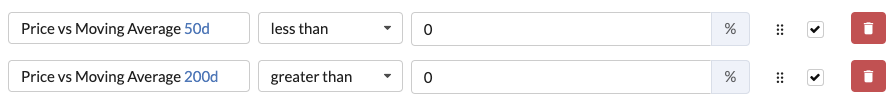
Recently confirmed Golden Cross (with recent price acceptance)
By using the lowest value of ‘zero’ it’s possible to find quite recent Golden Crosses. Because of their recency, these can be interpreted as an early appearance of a Golden Cross, but they may be seen by some as too junior and needing more time for confirmation.
Mature confirmed Golden Cross (with recent price acceptance)
By using higher values in these rules, it’s possible to find more mature charts showing the Golden Cross. It could be debated that due to their age, they have a lower life span compared to others.
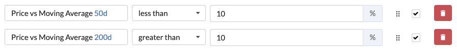
Interestingly, when using the value of 10% in this scenario, there is a high likelihood that the price will be positive compared to the 6-month change and 1-year change, but the desired metrics should always be inserted to guarantee selection.
With both these examples, if you are using “greater than” on both the 50 day and 200 day moving averages, you will need to apply the 50d vs 200d Moving Average Ratio of over 100 to guarantee that the results are still showing a Golden Cross.
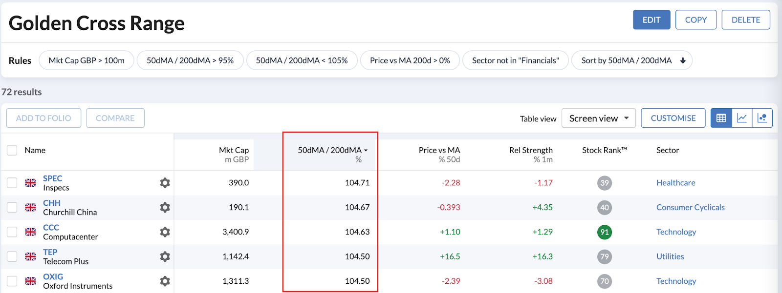
Finally, to find charts where the trajectory suggests that a Golden Cross has, or will soon appear, you can use the 50d vs 200d Moving Average Ratio twice. Adding the ratio twice - in this case using “greater than 95%” and “less than 105%” will return crossovers that are in a 10% crossing range.
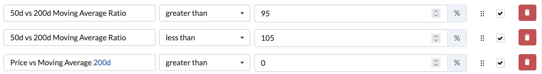
You can View, Copy and Save this screen here
An extra perspective for stock pickers
For many stock pickers, the idea of using charting techniques may well be unfamiliar. Yet Moving Averages can bring an extra perspective when it comes to understanding price trends. In some cases they offer a view of what the market thinks, and help to guide the timing of buy and sell decisions. In other cases they can be an important first filter in the search for stocks that are entering new uptrends and perhaps breaking out.
Either way, one or two simple strategy rules using MAs could offer a useful extra perspective in your market screening.

About Ben Hobson
Stockopedia writer, editor, researcher and interviewer!
Disclaimer - This is not financial advice. Our content is intended to be used and must be used for information and education purposes only. Please read our disclaimer and terms and conditions to understand our obligations.

Totally agree RedRon. I used these all the time. I'm doing my best but not finding the new site as easy to use in terms of TA. Still wish the previous TA features were here.
On mine the limit is 25 screens.How come yours is 50? I agree this should be increased as 25 is too low and I'm already getting to close to my limit. Maybe 100 screens limit?
I can't for the life of me figure out why there isnt a 200 MA on the mini charts. It's a standard chart technical indicator. There is the 50 MA which is the medium term trend, but no long term trend. Makes looking through hundreds of big charts to see the long term trend a right pain.
Yep - 'yet another feature dropped from the new site'. What about a 20/50 MA filter? That would perk things up a bit and encourage sub renewals.

Very useful article.
I asked for a feature where you can see the 100 (or 130day moving average) in the mini chart view - its not logical that a 1 year chart shows the 50d average and 3/6 years both show 200 and no chart view provides a 100/130d moving average line which is more appropriate for a 1 year or 3 year view, but didn't hear back. Please can we have this in mini chart view - it would be nice to also have candlesticks in minichart view if possible (like Finviz does) - Stockopedia is the only site (other than Finviz and Wallmine) that I know of that is global AND has a mini-chart view so would be good to build on your unique strengths.
Also, can we have a MACD such that the 50d is above the 100d moving average in the screener. This is ARGUABLY as or even more useful than whether price is above these averages as a screening tactic.
Second point is that in the "Today" section, it tells us number of stocks advance and declining in a day on various indices. This is practically pretty useless in isolation. What would be good to know is a) what that ratio is of advancers to decliners and b) most importantly, what direction is this moving in vs last week or last month (not yesterday, but right now we can't even see what it was yesterday!). That is, we need to know if advancers are outpacing decliners and the trajectory of that move. This would again be a great strength of Stockopedia (there is a recent study on SSRN by Adam Zaremba - who uses REFINITIV data - same as Stockopedia - to construct these ratios, that shows that investing in markets with the greatest ratio provides a significant edge) as there is only one other site that does it (marketinout.com)
Thank you - would be great to get a response.
I wasn't aware that the 200 MA does show but only on the 3/6 year timeframe. Thanks for that. Still, it should also be available on the yearly charts. Far better is to have both the 50 and 200 MA on the same mini chart across all time frames. Candlesticks option would be great also. Also great, 2 or more MA( timeframes user definable) on the mini charts at once to see golden crosses etc... There should be a settings panel for these options. As the coding is mainly to the GUI implementing these improvements should be minimal at best.
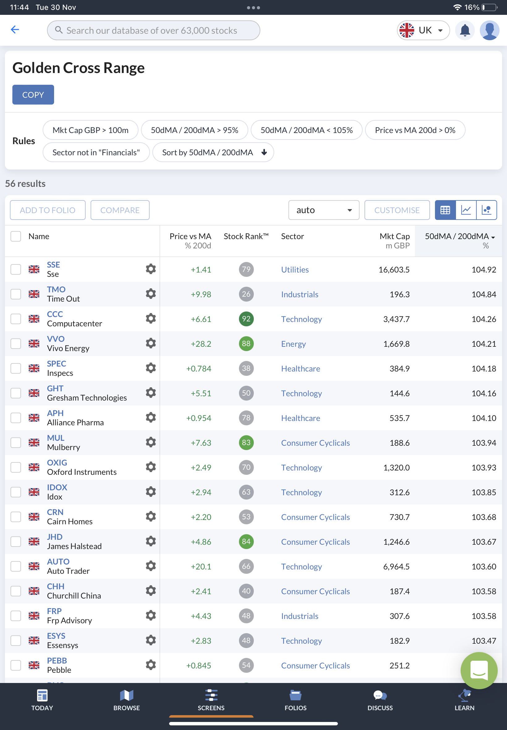
As a chart guy, of all the articles I've read since joining recently this one is easily my favorite. Wish there was a bookmark feature please! I had tried to create my own golden cross screen last week, playing around with the filters but coudn't get it exactly right... until your "golden cross range" screen came along that is. This screen is the goldilocks of golden cross screens - just what I was looking for. Shouldn't need any future alterations either as it's just perfect.
I’m new to investing but found this article very useful but I am struggling to work out how to use the Golden Cross range screen (last one in article) effectively, which is supposed to identify stocks that have or soon will enter a golden cross. This is obviously more useful than identifying older golden crosses.
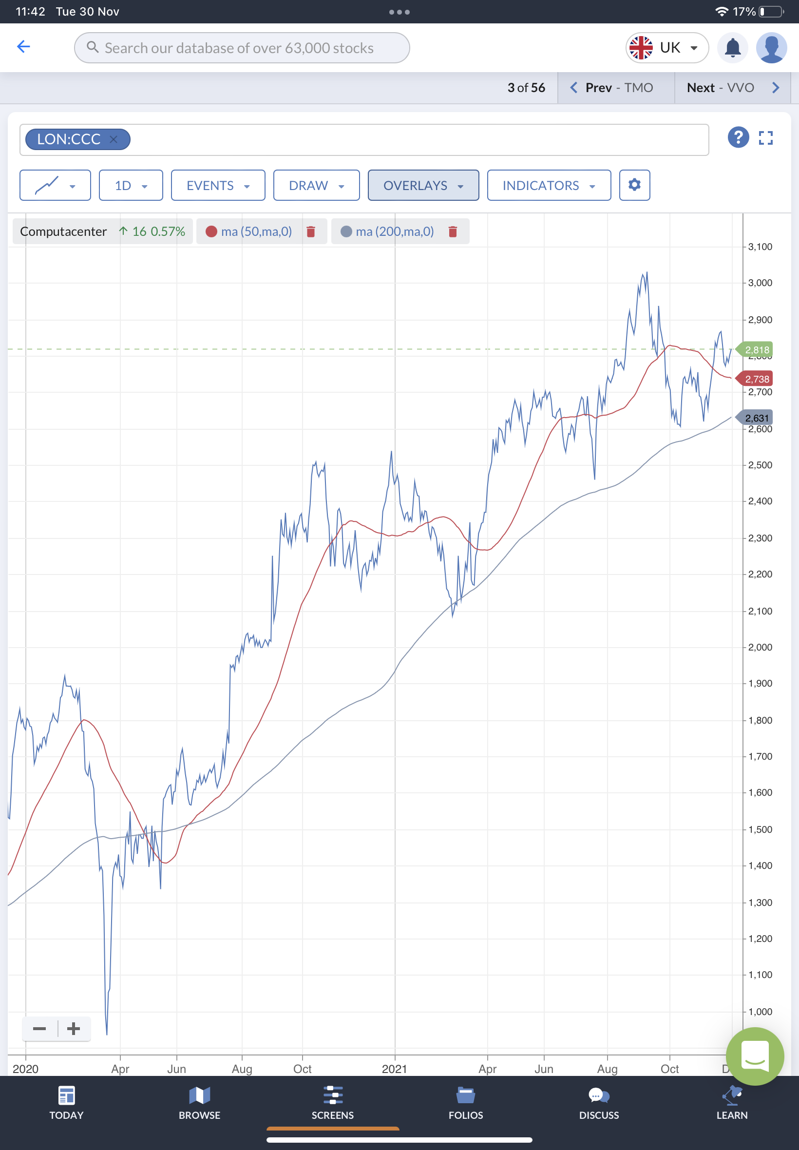
Most of the stocks i’ ve checked on that screen ( eg SSE or CCC) seem to be already in the midst of a mature golden cross? Am I missing something or does it mean they are likely to enter another one soon?
Any advice on how to use this screen effectively would be greatly appreciated!
Thanks
Jamie
This happens because the screen will show any charts where the 50dMA is within 5 percent of the 200dMA, above or below. If it is above than that could mean that there has just been a crossover. However, it could also mean that a crossover happened a while ago but the 50 dMA just now fell back down to within 5 percent of the 200dMA. Unfortunately, its not perfect, but its as good as its going to get within the current limitatons of the screening system. If the system had a time filter than it could work as intended.
Thats why its important that the mini charts show both the 50 dMA and the 200 dMA on the same charts. There is no substitute for the human visual system in picking out a golden cross especially when scanning hundreds of mini charts . I hope that this is in the works because having just one MA on the mini charts is a serious drawback

My understanding is that moving averages came before the invention of the macd, standard macd, being the subtraction of the 26 day moving average from the 12 day moving average, to result in a net day figure of 14 days. It is clear that the chap who introduced the macd, was interested in achieving a more timeous indicator, bearing in mind that the lag on a 200 day ma is 99 day and the lag on a 50 day ma, is 24 day. I may be incorrect as regard lag on the macd, but I think it would be 6 day. The macd ought to ordinarily provide better timeous signals compared with the golden cross. Other than the macd, the Bollinger bands heading in opposite directions usually herald a fast price movement, which is nicely timeouted by waiting for the lower Bollinger band to turnup, at which time sell for a quick profit.
My Bollinger band comment related to situations where the price is either above the 20 day ma or touching the upper Bollinger band. Bollinger band widenings herald fast movements in either direction up or down, so it's important to put the odds in favour by ensuring price is above the 20 day ma and to have a close stop in place, in case price reverses at a fast pace.


*Past performance is no indicator of future performance. Performance returns are based on hypothetical scenarios and do not represent an actual investment.
This site cannot substitute for professional investment advice or independent factual verification. To use Stockopedia, you must accept our Terms of Use, Privacy and Disclaimer & FSG. All services are provided by Stockopedia Ltd, United Kingdom (company number 06367267). For Australian users: Stockopedia Ltd, ABN 39 757 874 670 is a Corporate Authorised Representative of Daylight Financial Group Pty Ltd ABN 77 633 984 773, AFSL 521404.
Yes another feature dropped from the new site, so now we have to set up a screen, except that the limit on the new site is only 50 screens, when on the old site was unlimited, I have 89 and that is after deleting some, so I can't set anymore up without deleting 40 screens.
On the screen, you can't see when the 50MA crossed the 200MA, because only the 50MA is shown on the charts. It's important to know when it crossed.
It would be useful if the 200MA was shown on the minicharts, I think it used to be?
On folios is the place it needs to be.